venerdì 22 gennaio 2016

Questo Blog non verra più aggiornato.


This blog is off-line
Per il momento potette seguirmi su 
You can keep follow me on 


mercoledì 28 ottobre 2015

Waves Waves Waves


#waves #obsession

Campagna Crowfounding Help Us to Finish this Project


Su INDIEGOGO è online la nostra campagna di crowdfunding per completare tutta la app!!
Dopo un lungo lavoro abbiamo finalmente completato il primo livello di EgiBU..ma non è finita, anzi questa avventura è appena iniziata!!
Inoltre...se questa settimana passate dal Lucca Comics & Games, venite a salutarci al nostro stand "INDELEBILE J206", al primo piano del Real Collegio. Vi aspettiamo!! ‪#‎LuccaCG15‬
---------------------------------------------------------------------------------------------------------------------

You Can Find Eng Details into This Link! 
 

giovedì 30 aprile 2015

martedì 17 marzo 2015

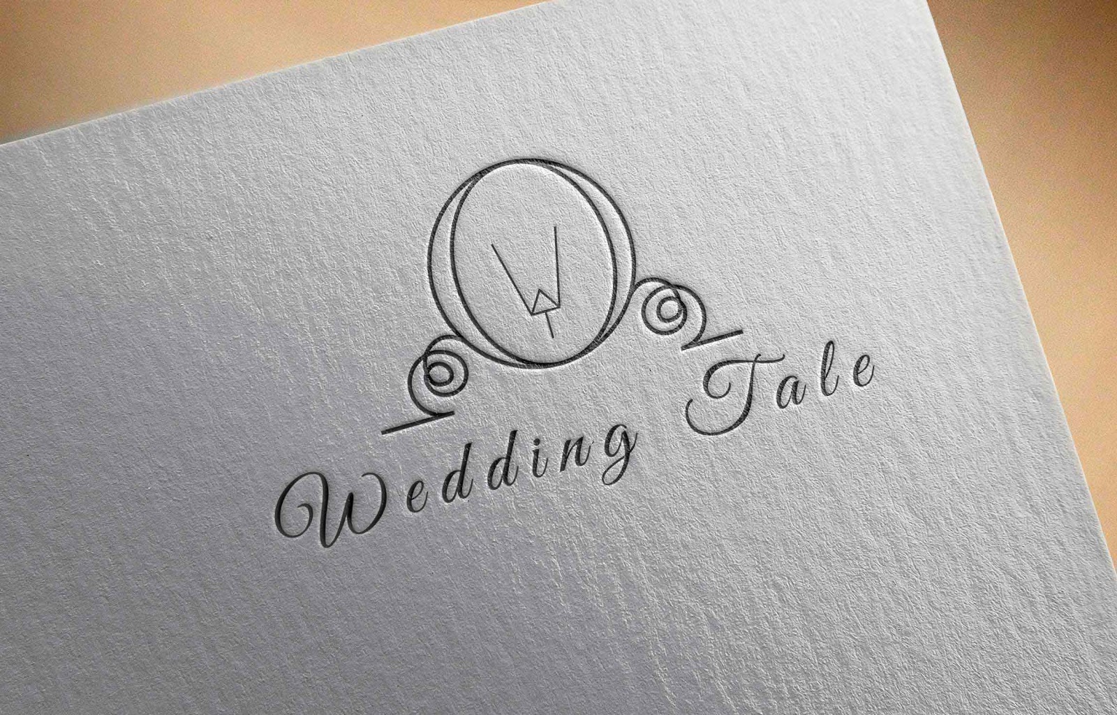
Logo Design - Wedding Tale

IT
Wedding Tale é un gruppo di Fotografi e Videografi per matrimoni.
Il logo é stato progettato  cercando di trovare un elemento che rappresenti il matrimonio e la favola che si cela dietro di esso, allo stesso tempo ho cercato di  trovare una figura che 
richiamasse il “vintage”, e cosa meglio di una carrozza!
Quindi é stata resa leggera dal fatto che presenta una sola linea che forma l’elemento e grazie alle forme circolari mantiene grazia ed eleganza che richiamano lo stile “british”.  
All interno ho pensato di inserire le iniziali di Wedding Tale. 
Utilizzando delle linee nette ho creato un contrasto tra le parti, che mira a definire la soliditá e professionalitá del gruppo.
Per il font ho scelto un carattere calligrafico che non spezzasse molto dal contesto armonioso delle forme.


ENG
Wedding Tale is a group of photographers and videographers for weddings.
The logo has been designed trying to find an element that represents the marriage and 
the story that lies behind it. 
At the same time I tried to find a figure that recalls the "vintage", what is better than a cab!
So having been made lighter by the fact that it has a single line which forms the element and thanks to the circular shapes maintain the grace and the elegance that recall the "British" style.
Inside I thought to put the initials of Wedding Tale. Using the sharp lines I created acontrast 
between the parties, which aims to define the solidity and professionalism of the group.
For the font I chose a character that calligraphic do not break it very context.


  • YOU NEED A WORK LIKE THIS ONE!
    Contact Me
    francesco.cerra at gmail.com
    --------------------------------------------------------
    Also Check Out the Photographers Page

domenica 2 novembre 2014

The legacy of Rubies - Shrinkfish Ltd.

The Legacy of Rubies_Unofficial Trailer from shrinkfish on Vimeo.

Some screen shoot from "The Legacy of Rubies" - 25 minutes short production by  Shrinkfish Ltd.
I worked at this project as a CleanUP and Color artist.
Stay tuned for date release!!

giovedì 30 ottobre 2014

ONEWAY project

IT
ONE WAY Projetct é un progetto di viaggio, ideato e realizzato da Nara Chini.
Il quale attraverso singoli biglietti di sola andata ha percorso, tramite mezzi terreni, la Russia, la Siberia, la Cina e molti altri paesi per arrivare alla meta finale Bali. 
L’ideazione del logo, viene dalla necessitá di contestualizzare ed identificare il diario di viaggio prevalentemente fotografico.
Il logo é stato progettato partendo da una figura con le braccia rivolte a V (viaggiare), figura che apre l’immaginazione a tutto ció che di bello un viaggio puó offrire, ma sopratutto al significato piú profondo di un viaggio in solitaria. 
La ricerca di se stessi e del proprio percorso di vita. 
Per esprimere al meglio questo concetto ho fatto partire dalla testa del personaggio una ciocca di capelli che racchiuda lo stesso in un cerchio, il cerchio della vita!


EN
ONE WAY Project is a project of a journey, designed and built by Nara Chini.
Which through individual one-way tickets has travel along , Russia, Siberia, China and many other countries to arrive at the final destination Bali.
The design of the logo, come from the need to contextualize and identify the photographic travelogue.
The logo has been designed from a figure with arms facing V (that in italian is the Capital Letter for travel), which opens the imagination to figure out all the beauty that a trip can offer, but especially to the deepest meaning of a solo journey.
The search for oneself and one's life path.
To better express this concept I made from the character's head a lock of hair that encloses the same in a circle, the circle of life!


  • YOU NEED A WORK LIKE THIS ONE!
    Contact Me
    francesco.cerra at gmail.com
    --------------------------------------------------------
    Also Check Out the ONE WAY - Project social pages


Mime Character

~ #pantone #sketch ~

mercoledì 2 luglio 2014

Commisioned Mural


Commisioned work ¦ Interior Design ¦ Disney
---------------------------------------------
Spray Paint - Brush